Introduction
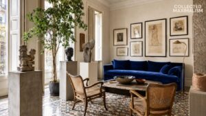
A gallery wall is never just a collection of frames. It is a quiet arrangement of memory, mood, and material—each piece placed not for symmetry, but for how it lingers beside the next. In romantic dark academia interiors shaped by collected maximalism, walls are not filled—they are composed.
There is a softness in these arrangements. Paintings that feel slightly faded, frames that carry time in their edges, portraits that seem to watch rather than decorate. These gallery wall ideas are less about display and more about presence—layered, thoughtful, and deeply atmospheric.
1. Building a Wall That Feels Collected, Not Planned
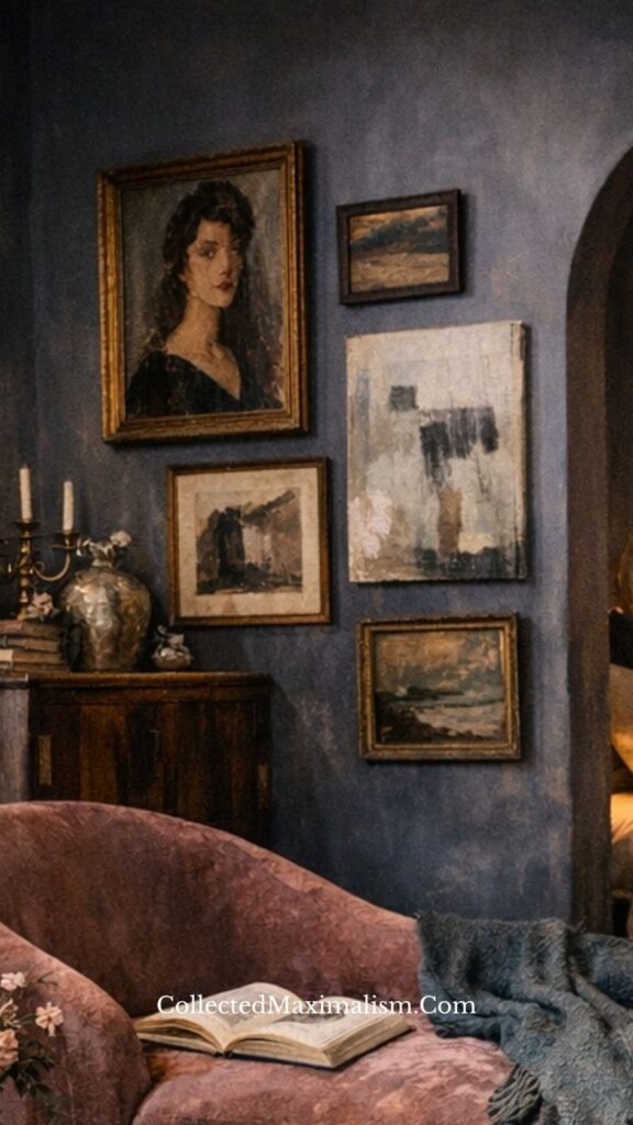
A gallery wall begins long before it is arranged. It starts with pieces gathered slowly—art found, inherited, chosen without urgency. The beauty lies in variation: different frame sizes, tones, and subjects coming together without rigid structure.
What makes it feel cohesive is not matching, but rhythm. A landscape beside a portrait, a sketch near a painting—each piece echoing another in tone or mood, creating a wall that feels lived-in rather than designed.
2. Anchoring the Composition with One Strong Piece
Even within a layered wall, there is often a quiet center. A larger painting or portrait anchors the arrangement, giving the eye a place to settle before moving outward.
This anchor does not dominate—it grounds. It allows surrounding pieces to feel intentional, creating balance within asymmetry and giving the wall a sense of calm within its richness.
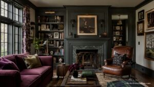
3. Letting Frames Speak in Different Tones
Frames are not just borders—they are part of the composition. A mix of aged gold, muted wood, and darker finishes adds depth without needing contrast.
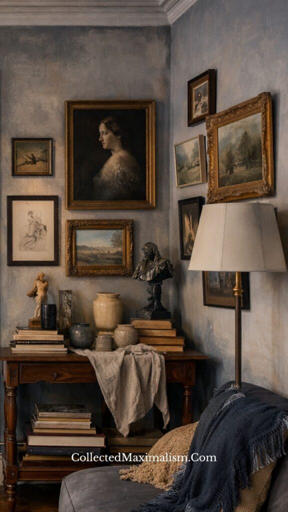
When tones shift subtly rather than dramatically, the wall feels unified. The variation becomes quiet rather than loud, allowing each piece to exist without competing for attention.
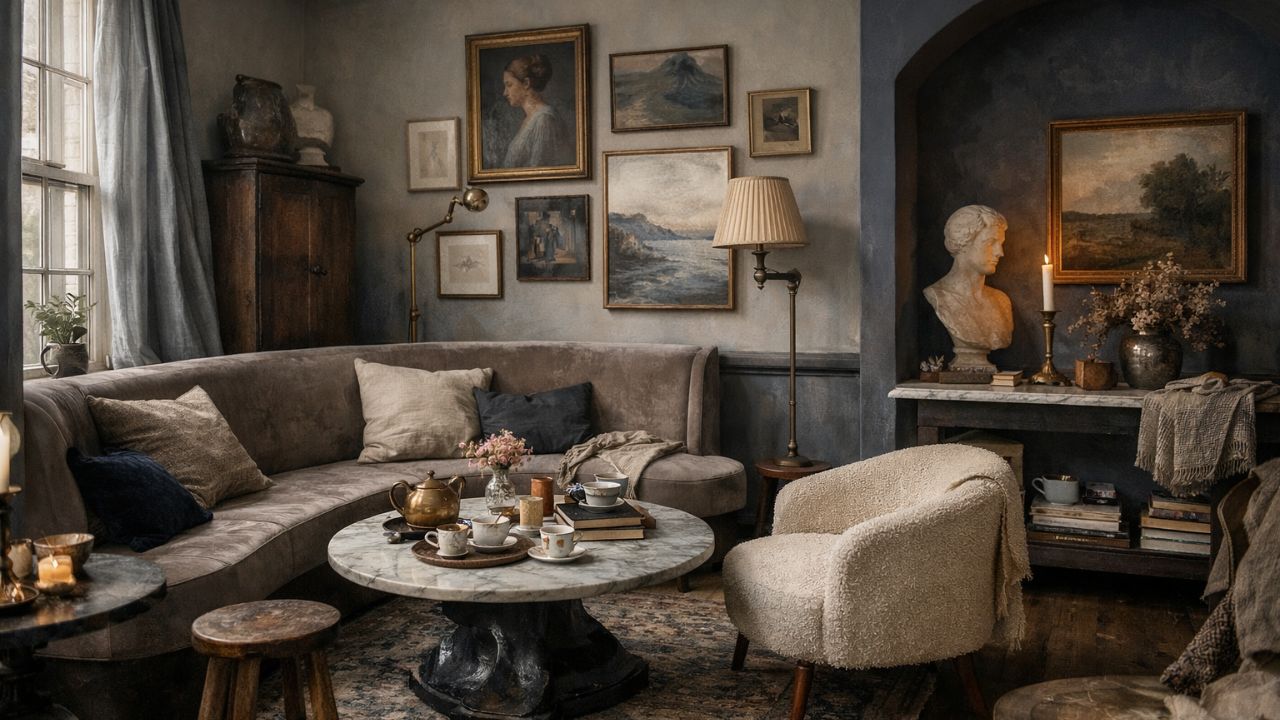
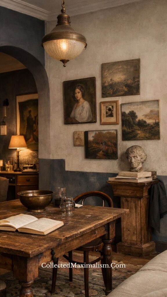
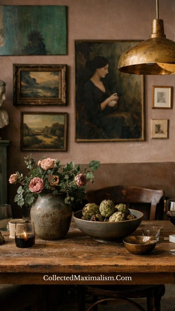
4. Layering Art with Objects Below
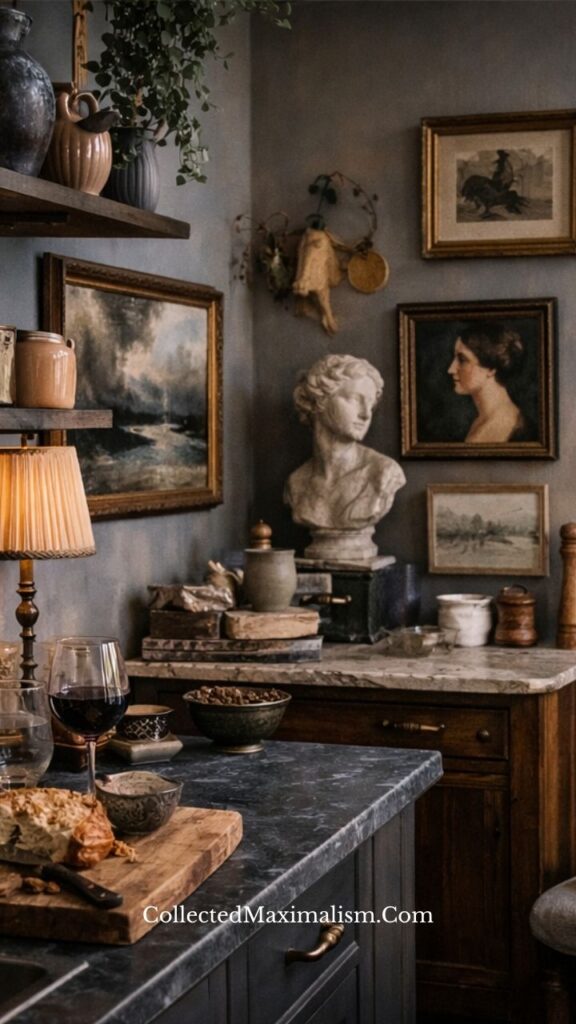
A gallery wall becomes more powerful when it connects to what sits beneath it. Consoles, sideboards, or tables extend the composition downward, creating a complete visual moment.
Books, busts, candles, and florals mirror the tones and textures of the wall above. This connection makes the space feel immersive—where objects and art belong to the same story.
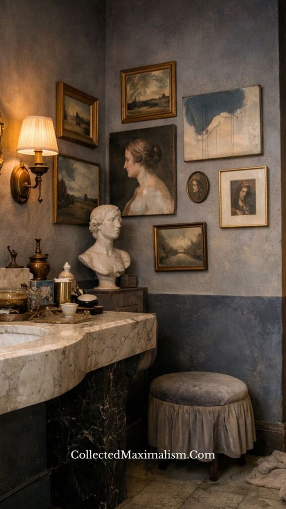
5. Using Soft Lighting to Shape the Mood
Lighting changes how a gallery wall is experienced. A nearby lamp or candle introduces warmth, softening edges and deepening shadows across frames and textures.
This light is not meant to highlight—it is meant to envelop. It creates atmosphere, allowing the wall to feel intimate rather than simply decorative.
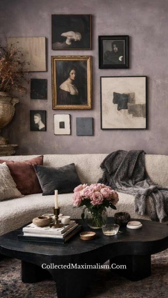
6. Creating Movement Through Imperfect Spacing
Perfect spacing can make a gallery wall feel rigid. Slight variations—closer placements, subtle overlaps, uneven alignment—introduce movement.
This imperfection feels natural. It allows the wall to breathe in an organic way, making the arrangement feel collected over time rather than measured in a single moment.
7. Mixing Art Styles Without Losing Cohesion
A successful gallery wall does not rely on one style alone. Classical portraits, landscapes, sketches, and even abstract pieces can coexist when united by tone and mood.
The key lies in restraint. Keeping the palette muted and materials consistent allows different styles to sit together without disruption, creating quiet harmony.
8. Creating Intimacy Through Corners and Smaller Spaces
Some of the most compelling gallery walls exist in corners, alcoves, or smaller spaces. These areas naturally create intimacy, allowing the arrangement to feel closer and more personal.
In these moments, the wall becomes less of a feature and more of a presence—something discovered rather than displayed.
More on Maximalism
Console Table Decor Ideas: Romantic Dark Academia Maximalism
8 Dining Table Decor Ideas | Romantic Dark Academia Maximalism
Light Fixtures in Maximalism: A Softer Approach to Layered Light
How to Style a Maximalist Home Using Memories, Art, and Travel Objects
Collected Maximalism: The Art of Composed Intensity
12 Types of Maximalism in Interior Design — And How to Use Them Intentionally
Collected vs Curated in Maximalist Interiors: Is There a Difference?
The Psychology of Maximalism: Emotional Density in Layered Interiors
Minimal Maximalism: Abundance Within Restraint
The Maximalist Way to Shop: How to Collect with Intention
Maximalist Interior Design: Layering Texture, Form, and Warm Earth Tones
Shopping / Sourcing
- Vintage oil paintings and portraits
- Antique-style frames (gold, wood, aged finishes)
- Small sketches and prints
- Decorative mirrors
- Classical busts
- Ceramic and metal vases
- Books with worn covers
- Candlesticks and soft lighting
- Linen textiles
- Small trays and collected objects
10 Common Mistakes in Romantic Dark Academia Gallery Walls
1. Over-planning the layout
When every frame is measured and pre-planned, the wall can lose its sense of ease. A gallery wall feels most natural when it evolves gradually, allowing each piece to find its place rather than being fixed too rigidly from the start.
2. Using identical frames
Uniform frames can make the wall feel flat and overly controlled. Variation in material and tone adds quiet depth, allowing each piece to contribute to a layered, collected feeling rather than blending into sameness.
3. Ignoring the space below the wall
A gallery wall does not exist in isolation. Without a console, table, or objects beneath it, the composition can feel disconnected. The space below helps ground the arrangement and complete the visual story.
4. Choosing overly bright artwork
Bright or high-contrast pieces can disrupt the calm, muted atmosphere. While a small variation can work, overly vivid artwork often draws too much attention, breaking the quiet cohesion of the wall.
5. Leaving too much empty space
Too much distance between frames can make the wall feel sparse rather than intentional. A slightly closer arrangement creates intimacy, allowing the pieces to relate to one another more naturally.
6. Making spacing too perfect
Perfectly equal spacing can feel rigid and overly designed. Small variations in distance introduce movement, helping the wall feel organic and gently assembled over time.
7. Mixing styles without cohesion
Combining different art styles can work beautifully, but without a shared tone or palette, the wall can feel disjointed. Cohesion comes from subtle connections—color, mood, or material—not strict uniformity.
8. Skipping lighting elements
Without soft lighting nearby, the wall can feel flat. A lamp or candle adds warmth and depth, allowing textures and tones to shift gently throughout the day and evening.
9. Hanging everything at the same level
When all frames align at the same height, the composition can feel static. Slight shifts—some higher, some lower—create rhythm and allow the eye to move more naturally across the wall.
10. Treating the wall as separate from the room
A gallery wall should feel like part of the space, not an isolated feature. When it reflects the room’s colors, materials, and mood, it blends seamlessly, becoming an extension of the overall atmosphere.
Conclusion
A gallery wall is never finished—it evolves quietly over time. Pieces are added, shifted, replaced, yet the feeling remains. It becomes less about arrangement and more about presence, where every frame carries a sense of belonging.
In romantic dark academia interiors shaped by collected maximalism, the wall is not just something you see. It is something you return to—layered, thoughtful, and always unfolding.
10 FAQs for Romantic Dark Academia Gallery Wall Styling
1. What defines a dark academia gallery wall?
A dark academia gallery wall is defined by mood rather than strict rules. It brings together vintage-style artwork, muted tones, and aged materials to create a sense of quiet depth. Portraits, landscapes, and sketches often sit together, forming a wall that feels thoughtful, slightly nostalgic, and gently layered over time.
2. How do you start building a gallery wall?
Begin with one or two pieces you naturally gravitate toward—often a portrait or a landscape. Let these act as your starting point, then build outward slowly. Instead of planning everything at once, allow the wall to evolve, adding pieces that feel connected in tone or mood.
3. Should frames match or vary?
Frames should vary, but within a quiet range. A mix of aged gold, dark wood, and muted finishes creates depth without feeling chaotic. The goal is not uniformity, but a subtle harmony where differences feel intentional rather than random.
4. How do you choose artwork for a cohesive look?
Cohesion comes from mood, not subject. Even if the artwork differs—portraits, landscapes, sketches—keeping a consistent color palette and softness in tone allows everything to sit together naturally. Think less about matching images and more about how they feel as a group.
5. Can modern art work in this style?
Yes, but it should be chosen carefully. Modern or abstract pieces work best when they are muted, textured, or slightly understated. When the tones align with the rest of the wall, even contemporary pieces can blend seamlessly into a more traditional setting.
6. How do you arrange frames without symmetry?
Instead of measuring equal distances, focus on visual balance. Place a larger piece first, then build around it, allowing spacing to vary slightly. The eye should move comfortably across the wall, even if the layout isn’t perfectly aligned.
7. What colors work best for gallery walls?
Muted, earthy tones work best—soft browns, dusty blues, warm neutrals, and faded greens. These colors allow the wall to feel layered and calm, rather than sharp or high-contrast. Subtle shifts in tone create depth without overwhelming the space.
8. Should you include objects with wall art?
Yes—objects bring the wall into the room. A console table, books, candles, or a sculptural piece below the artwork creates a complete composition. This connection makes the gallery wall feel integrated rather than floating on its own.
9. Can this style work in small spaces?
It works especially well in smaller spaces. Corners, alcoves, and narrow walls naturally create intimacy, making the arrangement feel closer and more personal. Scaling down the size of frames while keeping the layering intact maintains the effect.
10. How often should a gallery wall change?
There’s no fixed timeline. A gallery wall can remain as it is for years, or shift slowly as new pieces are found. Small changes—adding one frame, moving another—are often enough to keep it feeling alive without disrupting its balance.